REM, standing for “root em”, serves as a flexible CSS measurement unit, anchored to the font size of the root document element, typically the HTML element. By default, most browsers assign a 16px font size to the root, making REM units a cornerstone for creating designs that are scalable, consistent, and accessible.
The Mechanics of REM Units
REM units establish measurement by referencing the font size of the HTML root element. For instance, if the root’s font size is set to 16px, 1 rem equals 16 pixels. This relative measurement facilitates the development of designs adaptable across various devices and screen sizes, enhancing scalability and responsiveness.
Application of REM Units in Web Design
REM units find their use across various CSS properties, including font size, padding, margins, and widths, ensuring uniformity and flexibility in design scaling. The adaptability of REM units to different screen sizes makes them indispensable for responsive web design.
Setting the Root Element Font Size
Adjusting the root element’s font size, typically via the HTML or :root selector, directly influences all REM-based measurements. While the default size is 16px, setting a different base size allows for customized scaling of elements defined in REMs.
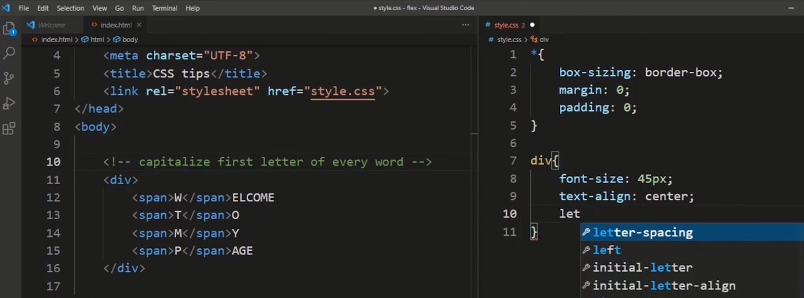
| :root { font-size: 16px; /* Adjust as needed */} |
Practical Example: Implementing REM in CSS
Consider a scenario where the root font size is modified to 32px. Applying REM units under this setup, such as setting an element’s font size to 1.5rem, translates to a 48px font size, demonstrating the direct correlation between the root size and REM-defined measurements.
The Merits of Adopting REM Units
Scalability
The adoption of REM units for web design projects brings unparalleled scalability benefits. By anchoring measurements to the root element’s font size, REM units facilitate the creation of designs that automatically adjust to the viewer’s screen size. This responsiveness ensures that a website’s layout and text remain legible and well-proportioned across devices, from desktop monitors to smartphones, enhancing the user experience by providing consistency and adaptability in viewing content.
Consistency
Utilizing REM units contributes to a harmonious visual experience across a website by ensuring that elements maintain consistent proportions relative to each other, regardless of the device or display size. This uniformity aids in reinforcing brand identity and keeping the user interface predictable and navigable for users. Designers can manage a site’s aesthetic more effectively, as adjustments to the root element’s font size reflect uniformly across all elements, making global style changes more efficient and less prone to errors.
Accessibility
Incorporating REM units into web design prioritizes accessibility, allowing users to adjust text sizes based on their preferences or needs without breaking the site’s layout. This adaptability is especially crucial for users with visual impairments who rely on customizing text sizes for readability. REM-based designs adapt fluidly to these adjustments, ensuring that content is accessible to a broader audience, thereby meeting web accessibility standards and improving overall user satisfaction.
Ease of Maintenance
The ease of maintaining and updating a website’s design when using REM units cannot be overstated. Changes to the site’s base font size ripple through all design elements proportionally, allowing for quick adjustments to the overall appearance without the need to individually alter each component. This global control mechanism simplifies the management of site aesthetics, making it easier for developers to implement design changes and ensure consistency across different pages and sections of a website.
Navigating the Challenges of REM Units
While REM units offer significant advantages, they also come with challenges that require attention. Compatibility with older browsers poses a potential obstacle, as some may not fully support REM units, leading to inconsistencies in how pages are displayed. Additionally, the decision to change the root element’s font size can have widespread effects on a site’s layout and must be approached with caution to avoid disrupting the intended design. Developers must employ fallbacks or alternative units for older browsers and thoroughly test any changes to the root font size across various devices to ensure the integrity of the design.
REM vs. EM vs. Pixels: A Comparative Analysis
REM units provide a level of predictability and simplicity that is not as easily achieved with EM units, which are influenced by the font size of their parent element. This distinction makes REM units more straightforward for establishing a base sizing system that applies across an entire website. On the other hand, pixels offer precision but lack the responsiveness and adaptability provided by REM and EM units, making them less suitable for fluid web design.
Pixels may still be useful for defining borders or other elements where absolute sizes are critical, but REM units are preferable for most other aspects of design due to their scalability and accessibility benefits.
Guidelines for Using REM, EM, or Pixels
Choosing between REM, EM, and pixels depends on the specific needs of the project and the desired level of responsiveness and accessibility. REM units are recommended for defining global styles, such as font sizes, margins, and padding, to ensure consistency and scalability. EM units may be more appropriate for component-specific styling, where relative sizes can create visually cohesive elements based on their parent container.
Pixels should be used judiciously, reserved for fixed-size elements where their absolute measurements are necessary. Balancing the use of these units allows designers to leverage the strengths of each, ensuring that web designs are both beautiful and functional across all devices and user settings.
Comparative Table: REM vs. EM vs. Pixels in CSS
| Criteria | REM Units | EM Units | Pixels (PX) |
|---|---|---|---|
| Relative To | Root element’s font size | Parent element’s font size | Absolute measurement; not relative |
| Scalability | Excellent; easily adjusts to screen size | Good; but can be complex in nested designs | Poor; fixed sizes don’t adjust well |
| Consistency | High; uniform scaling across the website | Medium; depends on parent elements | High; consistent but lacks responsiveness |
| Accessibility | Excellent; supports user-adjusted text sizes | Good; but less predictable than REM | Poor; fixed sizes can hinder readability |
| Ease of Maintenance | High; changing root size affects all REM units | Low; changes can have unpredictable cascading effects | Medium; straightforward but manual adjustments for responsiveness |
| Use Case | Ideal for responsive design, font sizes, margins, padding | Suitable for scalable components within a specific context | Best for borders, shadows, and other elements where absolute sizes are crucial |
| Browser Compatibility | Good; supported in all modern browsers | Good; supported in all modern browsers | Excellent; universally supported |
Video Guide
To answer all your questions, we have prepared a video for you. Enjoy watching it!
Conclusion
Incorporating REM units into CSS practices elevates web design through enhanced scalability, consistency, and accessibility. Despite challenges, the strategic application of REM, complemented by EM and pixels when appropriate, can significantly refine the user experience and design adaptability. Understanding and leveraging REM units pave the way for advanced web development, ensuring creations are not only visually appealing but also universally accessible and responsive.