CSS’s border-bottom property serves as a prominent instrument, enabling web designers and developers to add flair and a distinctive touch to their digital ventures. This property presents an opportunity to fine-tune the bottom border of elements, boosting the visual appeal of their web resources.
By manipulating the dimensions, style, and hue of the bottom border, one can craft unique designs, enhancing the aesthetic nature and ambience of your website.
In this all-encompassing guide, we will delve into a myriad of methods for effectively utilizing the border-bottom property, courtesy of CSS. Our coverage will span from deciphering the multiple customization options at your disposal to its hands-on implementation in HTML and CSS.
Delving into the Core of CSS Border-Bottom Property
The CSS Border-Bottom property serves as a cornerstone for styling web elements, offering web developers a wide berth to customize the lower border of any web component. The scope of these elements ranges from simple containers housing text to interactive buttons and expansive full-width sections.
In essence, the Border-Bottom property opens the doors for developers to modify the color, style, and width of the bottom border, creating an array of visual possibilities.
Breaking Down the Syntax
The Border-Bottom property is utilized through a straightforward syntax that is both easy to remember and to implement:
selector {

  border-bottom: value;

}

The section denoted as ‘value’ can dictate the width, style, and color of your bottom border. For instance:

/* Implementing a bottom border which is red, solid and 2px in thickness */

.certainElement {

  border-bottom: 2px solid red;

}
Implementing CSS Border-Bottom in HTML and CSS
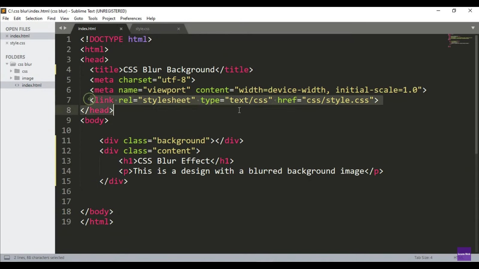
Incorporating the CSS border-bottom property within an HTML structure requires us to prepare a basic HTML page and collate a CSS code section. This foundational structure will facilitate customization of the borders.
Initiating the HTML Page Structure
Initiate the process by creating a basic HTML page structure. For this, you can utilize any text or code editor of your choice, such as Atom or Sublime Text.
The below code forms the skeletal structure of a basic HTML page:
<!DOCTYPE html>

<html>

<head>

  <title>Exploring CSS Border Bottom</title>

  <style>

    /* CSS code will be placed here */

  </style>

</head>

<body>

  <!-- HTML content will be inserted here -->

</body>

</html>
The <style> tags enclosed within the <head> section serve as the location for your CSS rule definitions.
Crafting a Box Element
Next, we need an HTML element to which we can apply the border-bottom property. For this, we can construct a simple box element using HTML and garnish it with some initial CSS styling.
<div class="outline">Box with a border</div>

.outline {

  width: 200px;

  height: 100px;

  padding: 20px;

  border: 3px solid sienna;

}
In this example, a <div> element labeled with the class “outline” is created. The width is set to 200 pixels and the height to 100 pixels. Padding of 20 pixels is added, and a solid border of 3 pixels thickness in the color sienna is applied. You can modify these values per your design needs.

Unlocking the Potential of CSS Border-Bottom Style Property Values
Before we dive deeper into the functionality of the property, it’s pivotal to grasp the crucial components of the border-bottom property and perceive how these individual entities shape the aesthetics of the bottom border.
1. Adjusting the Width with border-bottom-width
The border-bottom-width property is your go-to attribute for modulating the thickness of your bottom border. It renders the ability to dictate the thickness using various units of measurement.
This property’s default width is ‘medium’. However, receptive values like ‘thin’ and ‘thick’ remain at your disposal. Additionally, you can dictate a specific length or employ pixels (px) to supersede the default value with your customized width.
Here are a few illustrations:
<!DOCTYPE html>

<html lang="en">

<head>

  <meta charset="UTF-8">

  <meta name="viewport" content="width=device-width, initial-scale=1.0">

  <title>Four Different Border Widths</title>

  <style>

    .bordered {

      width: 200px;

      padding: 20px;

      margin: 20px;

      text-align: center;

    }

 /* Default width */

    .bordered.default {

      border: medium solid #3498db; /* To clearly visualize the borders */

    }

    /* Thin width */

    .bordered.thin {

      border-bottom-width: thin;

      border: thin solid #3498db; /* To clearly visualize the borders */

    }

   /* Thick width */

    .bordered.thick {

      border: thick solid #3498db; /* To clearly visualize the borders */

    }

    /* Custom width using pixels */

    .bordered.custom {

      border:2px solid #3498db; /* To clearly visualize the borders */

    }

  </style>

</head>

<body>

  <div class="bordered default">Default Border</div>

  <div class="bordered thin">Thin Border</div>

  <div class="bordered thick">Thick Border</div>

  <div class="bordered custom">Custom Border (2px)</div>

</body>

</html>
In the above instance, we have:
- A ‘medium’ bordered div with border-bottom-width:medium;
- A ‘thin’ bordered div with border-bottom-width:thin;
- A ‘thick’ bordered div with border-bottom-width:thick;
- A ‘custom’ bordered div with a specific pixel-defined border width.
2. Giving Shape to Your Style with border-bottom-style
Now, let’s turn our focus to the border-bottom-style property – a feature that lets you decide the pattern of your bottom border. This property offers a plethora of style options, each contributing a unique visual flair.
The ‘solid’ style, forming a continuous line, tends to be the go-to choice for most developers. However, don’t lose sight of other possibilities. ‘Dotted’ and ‘dashed’ styles create a series of dots and dashes respectively, while ‘double’ results in two parallel lines. Additionally, ‘groove’, ‘ridge’, ‘inset’, and ‘outset’ can provide a 3D effect to your border, influenced by the border-bottom-color value.
Here are a few examples to demonstrate the different styles:
<!DOCTYPE html>

<html lang="en">

<head>

  <meta charset="UTF-8">

  <meta name="viewport" content="width=device-width, initial-scale=1.0">

  <title>Four Different Border Widths</title>

  <style>

    .bordered {

      width: 200px;

      padding: 20px;

      margin: 20px;

      text-align: center;

    }

    .bordered.solid {

      border: medium solid #93b65a;

      border-bottom-style: solid; /* To clearly visualize the borders */

    }

    .bordered.dotted {

      border: medium solid #93b65a;

      border-bottom-style: dotted; /* To clearly visualize the borders */

    }

    .bordered.dashed {

      border: medium solid #93b65a;

      border-bottom-style: dashed; /* To clearly visualize the borders */

    }

    .bordered.double {

      border:medium solid #93b65a;

      border-bottom-style: double; /* To clearly visualize the borders */

    }

  </style>

</head>

<body>

  <div class="bordered default">Solid Border</div>

  <div class="bordered dotted">Dotted Border</div>

  <div class="bordered dashed">Dashed Border</div>

  <div class="bordered double">Double Border</div>

</body>

</html>
Within these examples:
- A ‘solid’ bordered div adopts the border-bottom-style: solid style;
- A ‘dotted’ bordered div features a border-bottom-style: dotted pattern;
- A ‘dashed’ bordered div utilizes the border-bottom-style: dashed style;
- A ‘double’ bordered div evokes the border-bottom-style: double style.
3. Adding a Splash of Color with border-bottom-color
The border-bottom-color property sets the stage for colorizing your bottom border. It enables you to set the color in various formats, such as named colors, hexadecimal codes, RGB values, or HSL values.
By default, the color matches the current color of the text, which it inherits from the parent element. However, this default color can be easily overhauled to suit your design’s palette.
Consider the following examples:
<!DOCTYPE html>

<html lang="en">

<head>

  <meta charset="UTF-8">

  <meta name="viewport" content="width=device-width, initial-scale=1.0">

  <title>Four Different Border Widths</title>

  <style>

    .bordered {

      width: 200px;

      padding: 20px;

      margin: 20px;

      text-align: center;

    }

    .bordered.blue {

      border: medium solid #3498db; /* To clearly visualize the borders */

    }

    .bordered.red {

      border: medium solid #3498db;

      border-bottom-color: #e74c3c; /* To clearly visualize the borders */

    }

    .bordered.green {

      border: medium solid #3498db;

      border-bottom-color: #27ae60; /* To clearly visualize the borders */

    }

    .bordered.yellow {

      border:medium solid #3498db;

      border-bottom-color: #f39c12; /* To clearly visualize the borders */

    }

  </style>

</head>

<body>

  <div class="bordered blue">Blue Border</div>

  <div class="bordered red">Red Border</div>

  <div class="bordered green">Green Border</div>

  <div class="bordered yellow">Yellow Border</div>

</body>

</html>
In the above examples:
- The ‘blue’ bordered div incorporates a border-bottom-color: #307ecf;
- The ‘red’ bordered div embraces a border-bottom-color: #d02e2e;
- The ‘green’ bordered div applies a border-bottom-color: #2ed065;
- The ‘yellow’ bordered div adopts a border-bottom-color: #d0c22e.
Here is a detailed video tutorial showing the implementation of different elements:
CSS Border Properties Comparison
Different CSS Properties for Border Styling
| Property | Description | Example |
|---|---|---|
| border-bottom | Specifies the bottom border of an element | border-bottom: 2px solid #007bff; |
| border-color | Sets the color for all borders of an element | border-color: #e74c3c; |
| border-radius | Defines the curvature of border corners | border-radius: 5px; |
| border-bottom-width | Sets the width of the bottom border | border-bottom-width: 3px; |
| border-style | Specifies the style of the border | border-style: dashed; |
| border-collapse | Determines the table border collapsing behavior | border-collapse: collapse; |
| border-spacing | Sets the spacing between cells in a table | border-spacing: 10px; |
Discovering the Beauty Of Web Design With CSS Borders
Customizing the Bottom Border
The CSS border-bottom property serves as a cornerstone in the realm of web design, offering a myriad of customization options to enhance the appearance of elements on a webpage. By manipulating parameters such as width, color, and style, designers can create unique visual effects that captivate visitors and elevate the user experience.
Adjusting the Width of the Bottom Border
One of the fundamental aspects of customizing the bottom border is controlling its width. By specifying the desired thickness, developers can achieve varying degrees of emphasis and visual impact. The following table illustrates different examples of adjusting the width of the bottom border:
| Border Width | Description |
|---|---|
| 1px | Delicate and subtle border |
| 2px | Standard thickness for emphasis |
| 4px | Bold and prominent appearance |
Incorporating these variations in border width allows for precise control over the visual hierarchy of elements, enabling designers to craft layouts that align with their aesthetic vision.
Changing the Color of the Bottom Border
Another key aspect of leveraging the CSS border-bottom property is selecting an appropriate color scheme for the border. Whether opting for a monochromatic palette or vibrant hues that complement the overall design, the choice of color plays a pivotal role in defining the visual identity of a webpage. Consider the following list of popular color choices for bottom borders:
- 3498db (Blue);
- 27ae60 (Green);
- f39c12 (Orange).
By strategically incorporating colors that resonate with the brand’s identity or evoke specific emotions, designers can establish a cohesive and engaging visual language throughout the website.
Setting Different Styles for the Bottom Border
In addition to width and color, the CSS border-bottom property offers a range of styles to add flair and personality to elements. From solid lines to dashed patterns, designers can experiment with various border styles to achieve diverse visual effects. Here are some common styles used for bottom borders:
- Solid: Creates a continuous line;
- Dashed: Generates a dashed pattern;
- Double: Produces two parallel lines.
By combining different styles with varying widths and colors, designers can craft intricate border designs that enhance the overall aesthetics of a webpage.
Adding Rounded Corners with border-radius
To further refine the appearance of elements, designers can incorporate rounded corners using the border-radiusproperty. By softening sharp edges and creating a more polished look, rounded corners lend a touch of elegance to buttons, containers, and other elements. The following example demonstrates how to apply rounded corners to a bottom border:
.element {

    border-bottom: 2px solid

# 333;

    border-radius: 5px;

}
By integrating rounded corners with customized bottom borders, designers can achieve a harmonious balance between aesthetics and functionality, resulting in visually appealing web interfaces.

Advanced Techniques
As designers delve deeper into the realm of CSS borders, they can explore advanced techniques that push the boundaries of creativity and innovation. From gradient borders that add depth and dimension to animating borders that introduce dynamic movement, these techniques offer endless possibilities for crafting visually captivating designs.
1. Gradient Borders
Gradient borders enable designers to incorporate smooth transitions between colors, creating a sense of depth and sophistication. By defining gradient properties within the border declaration, designers can achieve striking visual effects that elevate the overall design aesthetic.
2. Animating Borders
Animating borders introduce dynamic movement to elements, capturing users’ attention and enhancing interactivity. By utilizing CSS animations or transitions, designers can create engaging effects such as pulsating borders or transitioning colors, adding a layer of dynamism to the user experience.
3. Box Shadow for Depth
Incorporating box shadows alongside bottom borders can enhance the perception of depth and dimension within elements. By strategically applying shadow effects that complement the border design, designers can create a layered visual effect that adds richness and texture to the overall layout.
Conclusion
In conclusion, the CSS border-bottom property emerges as a powerful tool for web designers seeking to elevate the visual appeal of their creations. By mastering the customizing bottom borders through width adjustments, color selections, style variations, and advanced techniques, designers can transform mundane elements into visually captivating focal points. Embrace the versatility of CSS borders and unleash your creativity to craft immersive web experiences that leave a lasting impression on visitors.