
In the dynamic realm of React development, the choice of styling method can significantly impact the success of a project. Among the array of options, React Styled Components and CSS Modules stand out as prominent methods, each boasting distinct benefits. This narrative delves into the contrasts, merits, and possible limitations of these two dominant styling approaches, aiming to guide developers toward a well-informed choice for their forthcoming projects.
Key Takeaways
React projects can be enhanced by either Styled Components or CSS Modules, as both present unique strengths in flexibility, scalability, maintainability, and organization of code. When weighing these options, it’s crucial to consider performance implications. CSS Modules might lead to leaner bundle sizes, whereas Styled Components could excel in runtime efficiency. Insights gleaned from industry experts and practical project scenarios play a pivotal role in determining the most suitable choice based on the specific requirements of a project.
Understanding Styled Components in React
Styled Components, as a prominent CSS-in-JS library, empower developers to embed CSS directly within their component files, offering a revolutionary approach to styling in modern web development. This methodology brings several critical advantages that significantly enhance the development workflow:
- Dynamic Styling Capabilities: Through the use of props, Styled Components allow for styles to be dynamically adjusted based on component state or props, enabling real-time visual feedback and highly responsive designs;
- Scope-Limited Styles: Each Styled Component encapsulates its styles, ensuring that they are scoped only to the component itself. This prevents unwanted style leakage and conflicts, promoting cleaner and more predictable styling across the application;
- Theme Support: Styled Components facilitate easy theming and theme switching, allowing developers to define a set of styles that can be applied globally across all components. This is particularly useful for implementing dark/light mode features or customizing themes for different user preferences;
- Modularity and Reusability: By combining styles with components, developers can create highly modular and reusable pieces of UI. This approach significantly contributes to project maintainability and scalability, as components can be easily shared and reused across different parts of an application or even across projects.
These advantages underscore the appeal of Styled Components in modern web development, providing developers with a powerful tool for creating more maintainable, scalable, and dynamic user interfaces.
The Basics of Styled Components
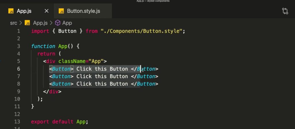
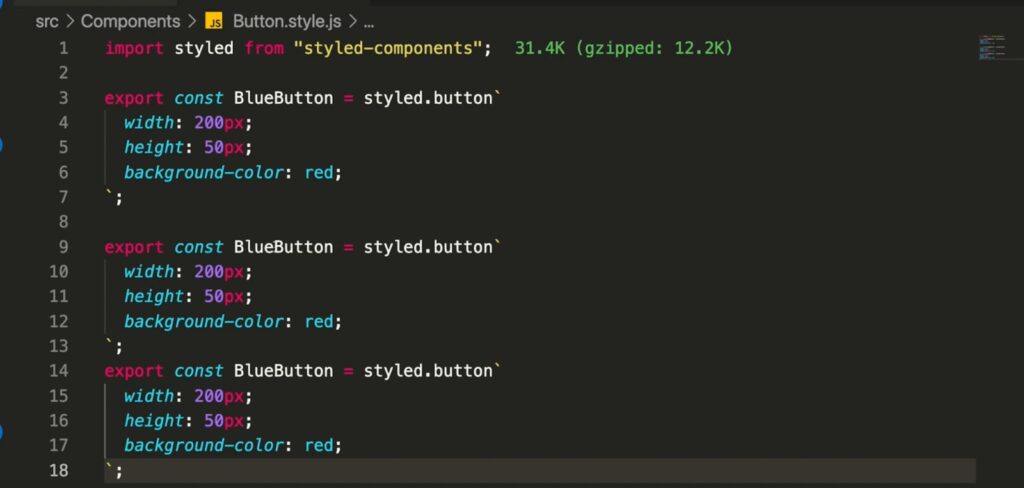
To effectively leverage Styled Components in their projects, developers initiate the process by importing the `styled` function from the Styled Components library into their JavaScript or TypeScript files. This foundational step eliminates the need for separate CSS files, streamlining the development workflow by integrating styling directly within component files. This methodology harnesses the full potential of CSS, thereby simplifying the process of styling React components in a manner that promotes modularity and reusability. Here’s how it enhances the styling approach:
- Direct Integration with Component Logic: By incorporating the `styled` function, developers can define styles in the same file as their component logic, fostering a tighter integration between the component’s appearance and its functionality;
- Dynamic Styling with React Props and State: Styled Components seamlessly integrate with React’s props and state systems, enabling developers to dynamically adjust styles based on the component’s data. This capability removes the cumbersome task of manually managing props to control styles, allowing for more intuitive and flexible design implementations;
- Simplified Adaptable Styles: The use of CSS variables within Styled Components further facilitates the creation of adaptable styles that can be easily modified or themed across the application. This approach empowers developers to build interfaces that can adapt to user preferences or application states without extensive code modifications.
This streamlined integration of styling within the component’s logic not only enhances developer productivity but also contributes to the creation of more dynamic, adaptable, and visually cohesive applications.
Dynamic Styling with Props
Utilizing props for dynamic styling with Styled Components introduces a level of design flexibility and responsiveness previously unattainable with traditional CSS methods. By allowing components to adjust their styles based on their usage context—such as changing colors, margins, or fonts in response to user interactions or data changes—developers can create a more interactive and engaging user interface. This adaptability enhances the UI’s responsiveness, making it not only visually appealing but also functionally responsive to user needs and preferences. The ability to pass props directly to Styled Components for conditional styling or theming purposes simplifies the development process, eliminating the need for cumbersome class name manipulations or inline styling. As a result, applications become more intuitive and user-centric, offering a seamless experience across different devices and screen sizes. This approach effectively bridges the gap between design and functionality, enabling the crafting of components that truly adapt to their environment.
Scoped Styles and Theming
Styled Components ensure style encapsulation within components and their children, safeguarding against unintended style leaks across the DOM. This encapsulation is crucial for maintaining a clean and consistent styling structure, free from the unpredictability of global style interference. By isolating styles to specific components, developers can make changes without fear of inadvertently affecting other parts of the application, thus promoting safer and more predictable styling practices. The integration of theming with Styled Components enhances this capability by allowing for the definition of global themes that can be applied locally within components. This facilitates the development of a cohesive design system that extends beyond mere visual aesthetics to include functional consistency and brand identity. Themes can be dynamically switched or adjusted, enabling applications to support multiple appearance modes (such as light and dark themes) or to align with user preferences, thereby improving the overall user experience and accessibility.
Demystifying CSS Modules for React
CSS Modules offer an alternative styling approach, focusing on component scope and unique class name generation to avoid global style conflicts. By automatically generating unique class names for each component, CSS Modules ensure that styles are localized, eliminating the risk of naming collisions and style overrides that can occur in large-scale projects. This method fosters a more organized and maintainable codebase, where developers can easily track and update component styles without navigating through a tangled web of global CSS. Additionally, the compatibility of CSS Modules with various CSS preprocessors and the ability to leverage code splitting techniques further enriches this styling methodology. Code splitting allows for the loading of styles relevant to the user’s current route or component, enhancing the application’s performance by reducing the initial load time. Through these features, CSS Modules not only streamline the development process but also contribute to the creation of more efficient and scalable web applications, demonstrating a practical balance between styling isolation and global management.
How Do CSS Modules Work?
By generating unique class names and employing hashing and scoping techniques, CSS Modules ensure that styles are contained within their respective components, maintaining the traditional CSS syntax’s benefits while avoiding name clashes.
Advantages of Code Splitting
The adoption of code splitting with CSS Modules can significantly boost application performance by reducing initial load times, thereby enhancing user experience and application efficiency.
Leveraging Preprocessors with CSS Modules
The integration of preprocessors like SCSS with CSS Modules introduces additional functionalities and syntax enhancements, including variables, nesting, inheritance, and more, thus allowing for more expressive and maintainable styling.
Performance Showdown: Styled Components vs CSS Modules
The performance comparison between Styled Components and CSS Modules reveals each approach’s unique strengths and weaknesses. CSS Modules generally yield smaller bundle sizes due to browser optimizations, whereas Styled Components may offer superior runtime performance, particularly in larger applications. However, the additional overhead from Styled Components might increase bundle sizes, while CSS Modules’ avoidance of runtime compilation ensures smoother performance and a better overall experience, especially in JavaScript-heavy projects.
Scalability and Maintainability
When exploring the realms of scalability and maintainability within React development, Styled Components and CSS Modules present their own set of advantages. Styled Components enable a dynamic and flexible styling approach, streamlining the management of styles and properties, especially in expansive applications. Conversely, CSS Modules advocate for a clear division of concerns and modular architecture, leading to a more organized and sustainable codebase.
Organizing Large Projects
For the organization of large-scale projects, CSS Modules stand out by fostering modularity and the separation of concerns, unlike the conventional approach of using plain CSS. This strategy involves segmenting CSS into smaller, functionally based modules, enhancing code organization, maintainability, and reusability. Adopting individual CSS files for each module further solidifies this structured approach.
CSS Modules uniquely identify each component’s class names, eliminating style overlaps and simplifying the task of managing and updating styles throughout the project. This method maintains a streamlined and orderly code structure.
Refactoring and Reusability
Refactoring and reusability are crucial for maintaining any project, areas where CSS Modules particularly shine. By breaking down CSS into smaller, modular chunks, updating and managing styles becomes more straightforward. This modularity not only boosts code reusability but also facilitates collaboration among developers, enhancing project cohesiveness.
Developer Experience and Learning Curve
The developer experience and the learning curve associated with Styled Components and CSS Modules can vary based on individual preferences and prior CSS experience. Both options offer easy setup procedures and extensive community support, simplifying the learning process and resolving potential challenges.
Ease of Use and Integration
Styled Components and CSS Modules each offer unique benefits concerning ease of use and integration. Styled Components provide a more integrated and intuitive styling method, allowing CSS to be written directly within component files. In contrast, CSS Modules adhere to a more conventional styling method by keeping CSS files separate from JavaScript.
Ultimately, the choice between these methodologies may come down to personal preference and the desired level of JavaScript integration.
Community Support and Resources
Both Styled Components and CSS Modules boast substantial community backing and resources, easing the learning curve and offering solutions to potential issues. Available resources for both frameworks include:
- Official documentation;
- GitHub repositories;
- Vibrant online communities;
- Various learning materials.
These resources ensure developers have access to the information and support needed for either Styled Components or CSS Modules.
This robust support system ensures developers can confidently choose between Styled Components or CSS Modules for their projects, knowing help is readily available. For additional resources and support, purecode.ai offers a plethora of customizable components and tools to further enhance project styling, serving as an excellent platform for developers seeking to elevate their styling strategies.
Design Systems and Consistency
In the quest for a cohesive design system in React projects, the choice between Styled Components and CSS Modules plays a pivotal role. Both offer pathways to a unified design language, yet Styled Components might edge out with its dynamic theming and style flexibility at the component level.
Building Blocks for UI Kits
The decision between employing Styled Components or CSS Modules for constructing UI kits often boils down to the desired level of integration with JavaScript. Styled Components offer a dynamic and highly flexible approach to styling, allowing developers to create uniquely styled components with the significant benefit of dynamic theming capabilities. This method suits scenarios requiring styles that adapt based on application state or user interactions, providing a seamless blend between JavaScript and CSS. On the other hand, CSS Modules present a more structured and modular approach to styling. By ensuring that each component is associated with unique class names and styles that are scoped specifically to it, CSS Modules effectively prevent style leakage and conflicts across the application. This results in a more organized and maintainable codebase, especially beneficial for large-scale projects requiring high levels of consistency and predictability in their design. Ultimately, the choice between Styled Components and CSS Modules hinges on the project’s specific needs for dynamic styling versus modularity and encapsulation.
Ensuring Style Consistency
Maintaining style consistency is attainable with either Styled Components or CSS Modules. Styled Components shine by allowing component-specific styles and dynamic theming, facilitating the creation and maintenance of a consistent design system. CSS Modules, advocating for modularity and separation of concerns, ensure a consistent and predictable styling experience by isolating component styles, thus promoting a uniform design across the project.
Comparison Table
| Comparison Aspects | React Styled Components | CSS Modules |
|---|---|---|
| Ease of Use | Enables intuitive and integrated styling within component files. | Adopts a traditional styling approach with separate CSS files. |
| Performance | May offer superior runtime performance but can encounter issues due to runtime compilation. | Optimized effectively by browsers for efficient caching and performance without runtime compilation. |
| Scalability and Maintainability | Fosters a dynamic styling approach for easier style and prop management in large apps. | Encourages a structured, modular codebase for enhanced maintainability. |
| Dynamic Styling | Supports dynamic styling with props and theming at the component level. | Lacks inherent dynamic styling capabilities. |
| Community Support | Backed by a large and active community. | Similarly enjoys substantial community support. |
| Integration with JavaScript | Offers a more cohesive experience with JavaScript via CSS-in-JS. | Maintains a distinct separation between CSS and JavaScript. |
| Design Systems and Consistency | Aids in creating and maintaining a cohesive design system with component-level theming. | Ensures consistency through modularity and component-specific styles. |
Personal Opinion and Case Studies
This segment unveils personal perspectives and real-world case studies from industry veterans, showcasing the practical applications and decision-making processes behind choosing Styled Components or CSS Modules.
Insights from Industry Professionals
Views from seasoned professionals shed light on the merits and drawbacks of Styled Components and CSS Modules in varied settings. Some laud Styled Components for encapsulating styles within components, while others favor CSS Modules for their modular structure and clear separation of concerns. Ultimately, the decision may rest on personal preference and the specific needs of the project at hand.
Real-World Project Examples
Real-life implementations provide a valuable lens through which the effectiveness of Styled Components and CSS Modules can be assessed:
- Airbnb has embraced CSS Modules for its extensive and complex codebase. This choice reflects their need for a system that supports a modular structure and ensures style encapsulation. By segmenting CSS on a component-by-component basis, Airbnb enhances the scalability and maintainability of its user interface, making it easier for developers to manage styles without fear of conflicts or cascading issues;
- Slack, known for its dynamic and highly customizable interface, has opted for Styled Components. This choice underscores their commitment to providing a flexible user experience that can be easily adapted to meet the diverse needs of its vast user base. Styled Components allow Slack to leverage JavaScript’s power to dynamically change styles based on user interactions or preferences, facilitating a more interactive and personalized experience;
- Reddit demonstrates an innovative approach by employing a hybrid strategy that combines the strengths of both Styled Components and CSS Modules. By using Styled Components for dynamic elements that require real-time style adjustments and CSS Modules for static components where stability and performance are key, Reddit showcases the versatility and flexibility of integrating multiple styling solutions. This hybrid model allows Reddit to optimize for both performance and flexibility, catering to the complex needs of its platform and community.
These examples highlight how different organizations have leveraged the unique benefits of Styled Components and CSS Modules to meet their specific needs. For developers, understanding these real-world applications can provide critical insights into the practical advantages and limitations of each method, ultimately guiding their choice of styling strategy for future projects. The ability to choose the right tool for the right job is essential in the fast-paced world of web development, and these case studies serve as valuable benchmarks for making informed decisions.
In-Depth Summary and Comparison
In summary, Styled Components and CSS Modules each bring distinct benefits to the table in styling React components. Styled Components provide a flexible, dynamic approach, enabling fine-tuned component-level styles and theming. Conversely, CSS Modules advocate for a modular, well-organized codebase. The selection between these styling giants hinges on personal preference, project specifics, and the level of JavaScript integration desired. With extensive community support for both, developers are well-equipped to navigate the styling landscape of their React projects.