Within the complex lattice of user interface design, each pixel and element critically influences the user experience. Among these components, the seemingly modest button wields considerable influence, acting as a conduit for a myriad of actions and features across digital platforms. Nonetheless, there arise instances when certain functionalities must be rendered temporarily inaccessible or irrelevant, leading to the necessity of deactivating buttons. This is where the art of Disable Button CSS comes into play – a nuanced yet powerful strategy that not only signifies the unavailability of a button’s function but also significantly improves user interaction by offering unmistakable visual indicators. In this discussion, we venture into the nuances of developing proficient Disable Button CSS, examining its significance, methodologies, and optimal practices to propel your interface design to unparalleled levels.
Demystifying the Various Button States in CSS: A Comprehensive Exploration
Understanding the myriad types of button states is pivotal in grasping the essence and functionality of buttons in web development. But first, let’s delve into the concept of a button state itself.
A button state reflects the present status of a button, revealing if it’s available for engagement, functioning actively, or in operational dormancy. Various states are employed by buttons to offer visual cues to the users, thus elevating the overall interaction and navigational ease.
In the arena of web development, a button could embody different states, each carrying a unique function. These functions not only enhance the user experience but also facilitate immediate feedback. Moreover, the diversified states of a button serve essential insights about its present functionality or condition, thereby optimizing the user experience on a holistic level.
The Default State: An Essential Starting Point
The default state signifies the initial appearance of a button when left unengaged or undisturbed. It’s predominantly in a neutral state, signaling the button’s readiness for usage. To maintain visual hierarchy and affordance, it is imperative that the default state is designed to stand out from the rest of the User Interface (UI) elements.
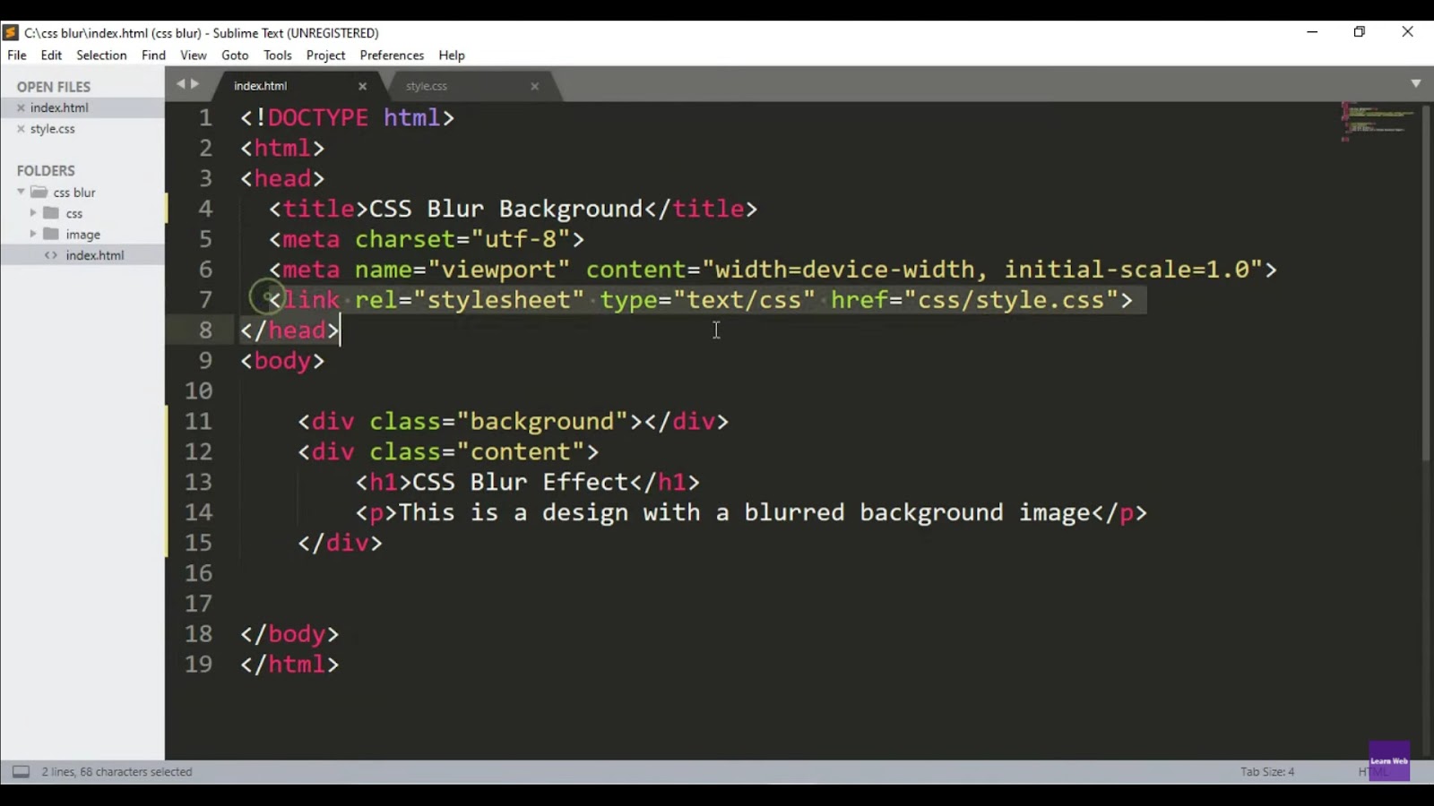
To give you a better understanding, consider the following default button example in CSS:
button {

  background-color: #007bff;

  color: #fff;

  padding: 10px 20px;

  border: none;

  cursor: pointer;

}
And the HTML to trigger this button:
<button>Default Button</button>This CSS snippet essentially styles a button with a brilliant blue (#007bff) background color, a white (#fff) font color, and padding of 10px vertically and 20px horizontally. The button has no border, and the mouse cursor changes to a pointer when hovered over the button, indicating its interactivity. The result is a striking and inviting clickable button that’s readily identifiable against the backdrop of other UI components.
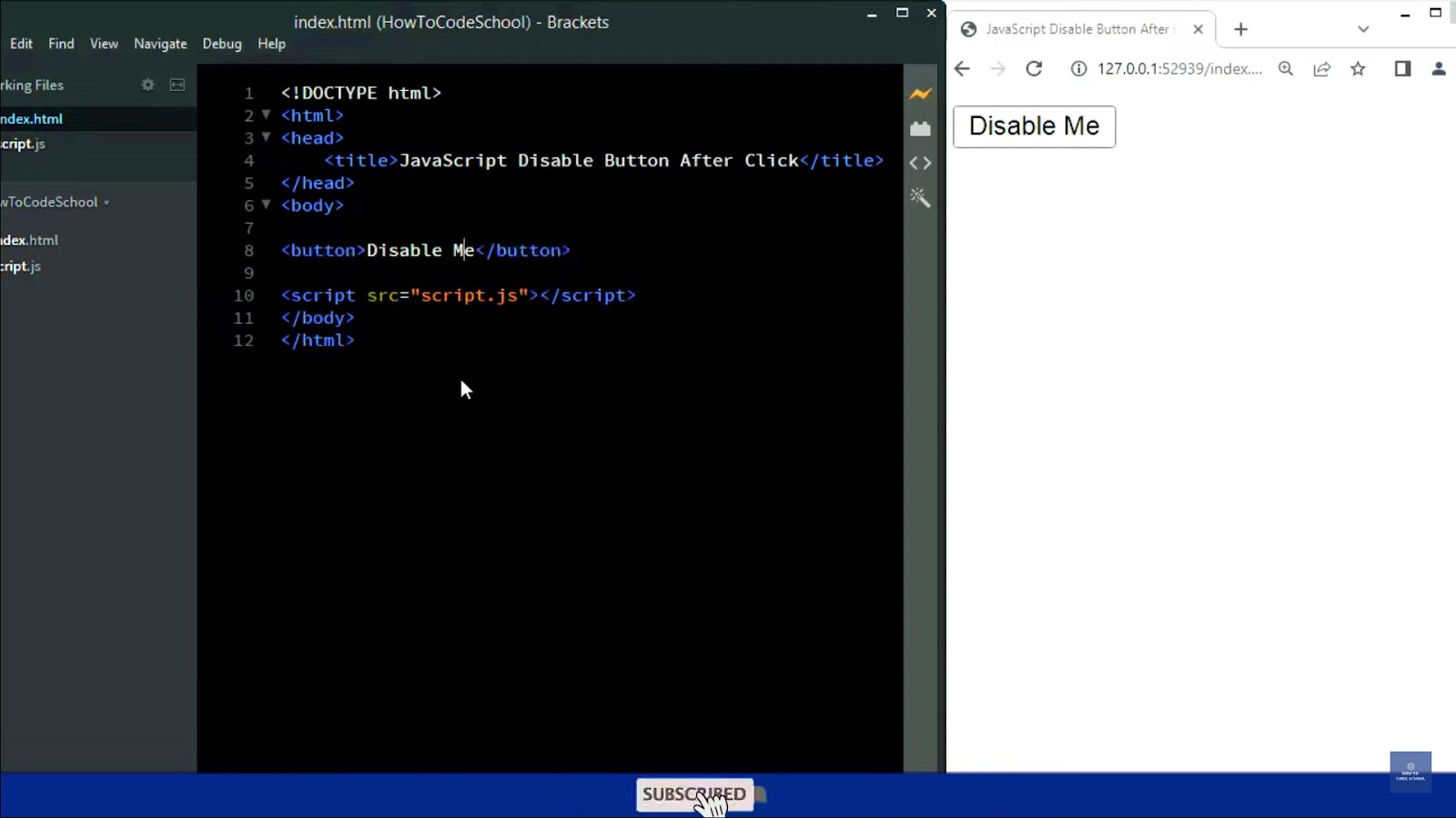
A Deep Dive into the Disabled Button State in CSS
The disabled button state plays an indispensable role in web development. This specific state provides a visual and functional indication that a particular button is temporarily unavailable for interaction.
The utilization of a disabled state is prevalent when the function linked to a button becomes inaccessible. By deploying this state, developers can effectively prevent users from interacting with a deactivated button, thereby preventing potential confusion or disruption in the user’s experience.
Let’s illustrate this with an example of a disabled button using HTML and CSS syntax:
button:disabled {

  background-color: #ccc;

  color: #666;

  font-size:20px;

}
And the HTML to trigger this disabled button:
<button disabled>Disabled Button</button>In the code snippet presented, the disabled attribute initialises the button to a disabled state. It then proceeds to demonstrate how CSS can customize the look of the disabled button.
The button boasts a muted, grey (#ccc) background color and a subdued, darker grey (#666) font color, both enhancing the indication of its disabled condition. The font size is pronounced at 20px, ensuring the text remains legible and distinguished to the average user despite the button’s inactive status.
The understanding of the disabled button state, along with its appropriate usage, can facilitate a smooth and efficient user experience, a cornerstone of successful web development projects.
Understanding the Hover Button State in CSS: Enhancing User Experience
A crucial user interface behavior — the hover button state — amplifies the user experience by indicating a button’s interactivity. It adds a visual effect, altering the button’s appearance when the user’s cursor hovers over it, without necessitating a click or tap. This state establishes a clear, immediate feedback loop, informing users that the button can be interacted with.
Let’s further dissect this concept with an illustrative example, showcasing a button with a hover state effect in HTML and CSS code:
<!DOCTYPE html>

<html>

  <head>

    <meta charset="UTF-8">

    <meta name="viewport" content="width=device-width, initial-scale=1.0">

    <title>Hover State Example</title>

    <style>

      button {

        background-color: #0000FF;

        border-color: #FF0000;

        color: #FFFFFF;

        padding: 15px 30px;

      }

      button:hover {

        background-color: #FF0000;

        transition: background-color 0.5s ease-in-out;

      }

    </style>

  </head>

  <body>

    <button>Hover Me!</button>

  </body>

</html>
In this provided piece of code, the button initially possesses a blue background (#0000FF), a red border (#FF0000), and white text (#FFFFFF). The padding values (15px vertically and 30px horizontally) ensure that the button has adequate breathing space, enhancing its visual appeal.
Upon hovering over the button, the background color changes to red (#FF0000). The transition property is used to smoothly change the background color over half a second, making the change pleasant and less abrupt for the user.
When implementing a hover state, consider the following guidelines:
- Choose a hover color that contrasts with the button’s original color, ensuring the hover effect is noticeable;
- Leverage the transition property in CSS to make the hover effect smooth and visually pleasing;
- Test the hover effect across different devices and browsers for compatibility, ensuring a consistent user experience.
Harnessing the power of the hover button state can significantly enhance interactivity and user engagement, making it a go-to tool for UI and UX designers alike.
Unraveling the Active Button State in CSS: Emphasizing User Interaction
Among the various button states, the active state holds a special place. It is triggered when a user clicks or presses the button, signifying that it’s currently being interacted with. This state imparts a strong visual cue, confirming that the user’s action has been recognized and is in the process of being executed.
This state usually entails changes to the button’s color, depth, or even incorporates an animation, all aimed at highlighting the button’s active status.
To facilitate a clearer understanding, let’s explore an example that demonstrates how to implement an active button state using HTML and CSS:
<!DOCTYPE html>

<html>

  <head>

    <meta charset="UTF-8">

    <meta name="viewport" content="width=device-width, initial-scale=1.0">

    <title>Active State Example</title>

    <style>

      button {

        background-color: #007bff;

        color: #ffffff;

        padding: 15px 30px;

        transition: background-color 0.3s ease-in-out;

      }

      button:active {

        background-color: #004080;

        color: #ffffff;

      }

    </style>

  </head>

  <body>

    <button>Click Me!</button>

  </body>

</html>
In the demonstrated snippet, the button is initially styled with a brilliant blue (#007bff) background color and white (#ffffff) font color. When the button is clicked (or is active), the background color shifts to a darker blue (#004080), while the font color remains white (#ffffff).
Here are a few key considerations while working with the active state in CSS:
- Create a noticeable contrast between the regular and active states of a button. This will provide clear feedback to users while they interact with the button;
- Use transitions to make the color change less abrupt and more visually appealing;
- Be mindful of color choices for the active state. Colors with similar shades or tones may not be clearly discernible, especially for colorblind users.
Incorporating the active state effectively can help ensure immediate feedback to the users, thereby streamlining the engagement and interaction flow. It further cement the mark of successful user interface design, making it a worthwhile aspect to master.
Decoding the Toggle Button State in CSS: Facilitating User Choice
Toggle buttons, with their unique ability to switch between two or more states, employ a set of additional states to reflect the current selection. For instance, a toggle button might exploit a ‘checked’ state to display a selected option and an ‘unchecked’ state to signify an unchosen alternative. Distinctions between varied options can be heightened using changes in color, border, or icons in these toggle states.
Creating a button with a toggle state involves a mix of HTML structure and CSS styling. The HTML structure serves as the backbone for the toggle switch, and the CSS imparts the desired aesthetic and functionality.
Let’s dive straight into the code, beginning with an elementary HTML structure:
<!DOCTYPE html>

<html>

  <head>

    <meta name="viewport" content="width=device-width, initial-scale=1">

    <style>

      /* The CSS code will be inserted here */

    </style>

  </head>

  <body>

    <h2>Toggle Switch</h2>

    <label class="switch">

      <input type="checkbox">

      <span class="slider round"></span>

    </label>

  </body>

</html>
This HTML structure is simple yet effective. It contains a label with an input checkbox and a span element. The input checkbox will serve as the interactive toggle switch, whereas the span will work as a slider around the switch.
Here are a few recommendations when implementing the toggle state feature:
- Make sure to visually differentiate between the ‘checked’ and ‘unchecked’ states, guiding the user toward an informed choice;
- Always test the toggle button’s functionality to ensure that it’s working as expected, and the different states are clearly marked;
- Keep accessibility in mind. Choose color contrasts and sizes that are easily discernible to all potential users.
Effectively constructed and implemented, the toggle button state can greatly enhance a user’s interaction with the interface, offering a smooth, satisfactory experience that caters to the user’s autonomy of choice.
CSS Styling for Toggle Button: Breathe Life into Your Switch
The CSS code plays a quintessential role in imparting style, animation, and functionality to the toggle switch. It transforms a simple HTML structure into a dynamic, interactive element enhancing the user interface.
Let’s break down the key CSS styles applied to bring the toggle switch to life:
.switch {

  position: relative;

  display: inline-block;

  width: 60px;

  height: 34px;

}

.switch input {

  opacity: 0;

  width: 0;

  height: 0;

}

.slider {

  position: absolute;

  cursor: pointer;

  top: 0;

  left: 0;

  right: 0;

  bottom: 0;

  background-color: #ccc;

  -webkit-transition: .4s;

  transition: .4s;

}

.slider:before {

  position: absolute;

  content: "";

  height: 26px;

  width: 26px;

  left: 4px;

  bottom: 4px;

  background-color: white;

  -webkit-transition: .4s;

  transition: .4s;

}

input:checked + .slider {

  background-color: #2196F3;

}

input:focus + .slider {

  box-shadow: 0 0 1px #2196F3;

}

input:checked + .slider:before {

  -webkit-transform: translateX(26px);

  -ms-transform: translateX(26px);

  transform: translateX(26px);

}

.slider.round {

  border-radius: 34px;

}

.slider.round:before {

  border-radius: 50%;

}
Some notable highlights for implementing CSS styling:
- Ensuring the toggle switch has a distinguishable ‘ON’ state, with clear visual cues. The change in background color to blue (#2196F3) serves this purpose;
- A smooth transition effect amplifies the user’s interaction. This is accomplished with -webkit-transition: .4s; and transition: .4s;
- Utilize box shadow (box-shadow: 0 0 1px #2196F3;) to subtly indicate when the button gets focused;
- Keep accessibility in mind by making the buttons sizable and the sliding animation easy to follow.
Adorned with carefully chosen CSS styling, a toggle button state becomes a valuable tool in delivering an engaging and intuitive user experience.
Crafting a Button for Your Website
In the dynamic world of web development, mastering the art of creating buttons is akin to wielding a magic wand. Buttons aren’t merely decorative; they’re the conduits through which users interact with your website, guiding them through the digital landscape. Let’s delve into the process of creating a button, transforming mere lines of code into captivating clickable entities.
Understanding the Anatomy of a Button
Before diving into the coding trenches, let’s grasp the foundational components of a button:
HTML Structure: Utilizing the <button> tag forms the skeleton of your button.
CSS Styling: Elevating its appearance and functionality through cascading style sheets.
HTML Magic: Defining Button Structure
In the realm of HTML, every line of code weaves together to create a digital tapestry. Let’s construct the structure of our button using HTML:
<!DOCTYPE html>

<html lang="en">

<head>

    <meta charset="UTF-8">

    <meta name="viewport" content="width=device-width, initial-scale=1.0">

    <title>Your Website Title</title>

</head>

<body>

    <button>Click me</button>

</body>

</html>
This simple HTML snippet lays the groundwork for our button. Yet, its potential remains untapped, awaiting the artistic touch of CSS to bring it to life.
Breathing Life into Your Button with CSS
Ah, the magic of cascading style sheets! CSS empowers us to transcend the mundane and infuse our button with personality. Let’s imbue our button with style:
button {

    background-color: #4CAF50; /* Green */

    border: none;

    color: white;

    padding: 15px 32px;

    text-align: center;

    text-decoration: none;

    display: inline-block;

    font-size: 16px;

    margin: 4px 2px;

    transition-duration: 0.4s;

    cursor: pointer;

}

button:hover {

    background-color: #45a049;

    color: white;

}
Behold the transformation! Our once plain button now dons vibrant hues and subtle animations, beckoning users to engage with its allure.
Enhancing the Visual Appeal of Buttons
In the dynamic realm of web design, buttons serve as pivotal elements that facilitate user interaction. Elevating the visual prominence of buttons not only enhances the aesthetic appeal of a website but also fosters a seamless user experience. By integrating style modifications using CSS (Cascading Style Sheets), designers can imbue buttons with bespoke visual characteristics that resonate with the website’s overarching design language and branding.
Exploring the Essentials of Button Styling
Unlocking the potential of CSS, we delve into foundational techniques for infusing buttons with captivating styles. Below, we delineate key strategies for augmenting the visual allure of buttons, encompassing the customization of border attributes, text color, and dimensions.
CSS Code for Styling Buttons:
button {

    background-color: #3498db; /* Defines the background color */

    color: #ffffff; /* Specifies the text color */

    padding: 10px 20px; /* Establishes space around the text */

    border: none;

    border-radius: 5px; /* Incorporates rounded corners for a contemporary aesthetic */

    cursor: pointer; /* Indicates cursor behavior upon interaction */

}
Comprehensive Techniques for Button Styling:
- Background Color Customization:
- Choose a color scheme that harmonizes with the website’s palette;
- Experiment with gradients or patterns to add depth and visual interest;
- Ensure adequate contrast between the background color and text for enhanced readability.
- Text Color Enhancement:
- Opt for a text hue that contrasts effectively with the background color for optimal legibility;
- Employ subtle variations in text shade to denote button states (e.g., hover or active).
- Padding Adjustment:
- Adjust padding values to fine-tune the spacing around the text within the button;
- Maintain consistency in padding across various button instances for uniformity in design.
- Border Customization:
- Define border attributes to delineate the boundaries of the button;
- Experiment with border styles (e.g., solid, dashed, or dotted) to accentuate visual appeal;
- Implement border-radius for rounded corners, imparting a modern and polished look.
- Cursor Designation:
- Specify the cursor behavior upon interaction to provide visual feedback to users;
- Opt for cursor styles such as ‘pointer’ to indicate clickable elements, enhancing usability.
Unveiling the Power of Disabled Buttons in UI Design: Enhancing User Experience and Accessibility
Disabled buttons in web development play a crucial role in guiding users and enhancing their overall experience on a website or application. These buttons are not just a visual element; they serve a multifaceted purpose aimed at ensuring smooth navigation and interaction. Let’s delve deeper into the significance and benefits of disabled buttons in UI design:

Preventing Incorrect Actions:
- Guardians of User Intentions: Disabled buttons act as vigilant sentinels within the interface, protecting users from unwittingly triggering actions that might lead to undesired outcomes. They stand as silent protectors, ensuring that users tread cautiously and deliberately through their interactions;
- Error-Proofing Mechanisms: Through their mere presence, disabled buttons serve as beacons of caution, signaling to users the unavailability of certain actions at specific points in their journey. For example, a disabled “Submit” button gently nudges users to revisit and complete all mandatory fields before progressing further;
- Clear Indication: Disabled buttons provide a clear visual cue that certain actions cannot be executed presently;
- Prevent Accidental Submissions: They help prevent users from submitting incomplete or incorrect information;
- Guide Users Towards Completion: By signaling missing information, disabled buttons guide users towards completing necessary fields before proceeding.
Enhancing User Interaction:
- Error-Reducing Allies: Disabled buttons actively collaborate with users to navigate the interface seamlessly, minimizing the likelihood of errors or missteps along the way. Their presence acts as a silent mentor, gently steering users towards the correct path;
- Efficiency Enablers: With disabled buttons strategically placed, users traverse the interface with confidence and precision, unlocking a smoother, more efficient journey. This harmony between user and interface fosters a sense of accomplishment and satisfaction;
- Boost User Confidence: Users feel more confident when they are guided by disabled buttons, knowing that they won’t make any inadvertent mistakes;
- Smoother Navigation: Clear indications of unavailable actions help users navigate the interface smoothly, reducing frustration;
- Enhanced Productivity: Streamlined interactions facilitated by disabled buttons contribute to increased user productivity and satisfaction.
Improving Inclusivity:
- Accessibility Champions: Disabled buttons champion the cause of inclusivity by ensuring that users of all abilities can engage with the interface effortlessly. They serve as bridges, connecting users with disabilities to the digital realm in a seamless and equitable manner;
- Empowering Assistive Technologies: Screen readers and other assistive technologies rely on the clarity and consistency provided by disabled buttons to effectively communicate interface elements to users with disabilities. These buttons act as reliable anchors in the sea of digital information, guiding users towards meaningful interactions;
- Equal Access: Disabled buttons ensure that users with disabilities have equal access to interface functionalities;
- Support for Assistive Technologies: Clear cues from disabled buttons assist screen readers in providing accurate information to users with disabilities;
- Promote Inclusivity: Incorporating disabled buttons promotes a culture of inclusivity and accessibility in design practices.
Design Elegance and Functionality:
- Simplified Interfaces: Through the strategic integration of disabled buttons, UI designers craft interfaces that exude elegance and simplicity. These interfaces are like well-oiled machines, operating smoothly and effortlessly, enhancing the overall user experience;
- Error-Resistant Design: The judicious use of disabled buttons serves as a shield against errors, ensuring that users traverse the interface without encountering unnecessary obstacles. Designers wield disabled buttons as tools of precision, sculpting interfaces that are both resilient and user-friendly;
- Enhanced Aesthetics: Disabled buttons contribute to the overall visual appeal of the interface, adding a layer of sophistication and clarity;
- Error Minimization: Incorporating disabled buttons helps minimize user errors, leading to a more seamless and enjoyable interaction;
- Balanced Design: The presence of disabled buttons strikes a delicate balance between aesthetics and functionality, resulting in interfaces that are both visually pleasing and highly usable.
Leveraging PureCode.ai for Seamless Development:
PureCode.ai presents a revolutionary solution for streamlining your code development process. By harnessing its capabilities, you can significantly optimize your workflow and enhance the efficiency of your UI development endeavors. Here’s how PureCode.ai can benefit your project:
- Time Savings: With a vast library of customizable and pre-built components, PureCode.ai eliminates the need for repetitive coding tasks, allowing you to focus on more strategic aspects of your project;
- Customization: Tailor-made components offered by PureCode.ai enable you to swiftly integrate complex functionalities into your interface without the hassle of extensive coding;
- Effort Reduction: By providing ready-to-use components, PureCode.ai simplifies the development process, reducing the effort required to implement various features and functionalities;
- Enhanced Productivity: With PureCode.ai handling the mundane coding tasks, you can allocate your time and resources towards innovation and problem-solving, accelerating the overall development cycle;
- Quality Assurance: PureCode.ai’s meticulously crafted components undergo rigorous testing, ensuring high standards of quality and reliability in your UI development projects.
Conclusion
In conclusion, mastering the art of Disable Button CSS is an essential facet of user interface design that transcends mere aesthetics. It embodies a strategic approach to enhancing user engagement and clarity, ensuring that digital environments remain intuitive and responsive even when certain actions are not feasible. By integrating sophisticated Disable Button CSS techniques and adhering to best practices, designers can significantly uplift the user experience, making digital interactions not only more seamless but also more meaningful. This exploration into Disable Button CSS underscores its critical role in the broader context of UI design, inviting designers to refine their craft and contribute to the creation of more accessible, user-friendly digital spaces.