In the domain of web design, the significance of every single pixel cannot be overstated. From font selection to the meticulous arrangement of elements, each constituent contributes to the holistic appeal and functionality of a website. Within a web designer’s toolkit lies CSS, or Cascading Style Sheets, a formidable instrument enabling precise control over visual presentation.
Amidst the array of CSS attributes, text-shadow emerges as a subtle yet profoundly influential feature capable of enhancing the allure of text elements on a webpage. Whether employed to augment legibility, infuse visual depth, or inflect a dash of panache, mastery of text-shadow empowers designers to fashion compelling and dynamic user experiences.
This extensive manual embarks on a thorough exploration of text-shadow within CSS. We’ll delve into its syntax, attributes, and pragmatic implementations, furnishing you with the expertise and dexterity to wield this adaptable tool with assurance. Whether you’re a seasoned developer seeking to hone your craft or a novice eager to embark on the journey, this piece serves as your navigational compass to unlocking the full potential of text-shadow in CSS.
Harness the Power of CSS Text-Shadow: A Detailed Examination
Text shadows, similar to box shadows, can dramatically enhance the aesthetics of a website. They lend depth and visual appeal to otherwise flat and uninteresting text. While box shadows are used to add shadows around an element’s borders, text shadows are used to apply shadows directly to the text.
Understanding the Text-Shadow Property
To add shadows to text, the CSS text-shadow property is used. This property accepts four values, which dictate how the shadow will appear. These are:
- Offset-x: This specifies the horizontal distance of the shadow from the text. Positive values will position the shadow to the right of the text, while negative values move it to the left;
- Offset-y: This represents the vertical distance of the shadow from the text. Positive values will position the shadow below the text, and negative values will position it above;
- Blur radius: This defines the degree of blurring to the shadow. A larger value will create a more blurred shadow, thus softening its edges and providing a subtle, diffused appearance;
- Color: This denotes the shadow’s hue. It can be defined in several formats: named colors, hex color codes, RGB, RGBA, HSL, or HSLA.
In practical terms, the text-shadow property syntax should look like this:
text-shadow: offset-x offset-y blur-radius color;
A small change in any of the above values can drastically change the appearance of the shadow, allowing endless customization possibilities. Consequently, it’s crucial to understand each property and experiment with them in a variety of combinations to achieve the desired look.
To ensure cross-browser compatibility, it’s recommended to use RGBA color values for the text-shadow property. This way, even if a browser doesn’t fully support the text-shadow property, the RGBA value will ensure the text remains visible.
Mastering the text-shadow property can open up a world of exciting and visually appealing possibilities. Therefore, take the time to thoroughly understand and experiment with these values for the best results.
CSS Text-Shadow: Comprehending the Application
The text-shadow property in CSS is a remarkable feature that can significantly change the visual feel of a website. Simply put, this property enables developers to add shadow effects to text, transforming each letter into an interactive design element with depth and character.
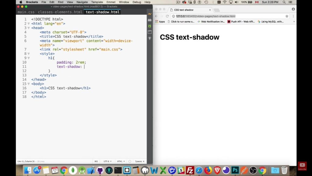
Here’s how you can start implementing text shadows in your CSS code:
text-shadow: 1px 1px 2px black;
This line of code applies a black shadow to the text. The shadow is 1 pixel to the right and 1 pixel down from the text, with a blur radius of 2 pixels. The overall result is a subtle, aesthetically pleasing depth effect.
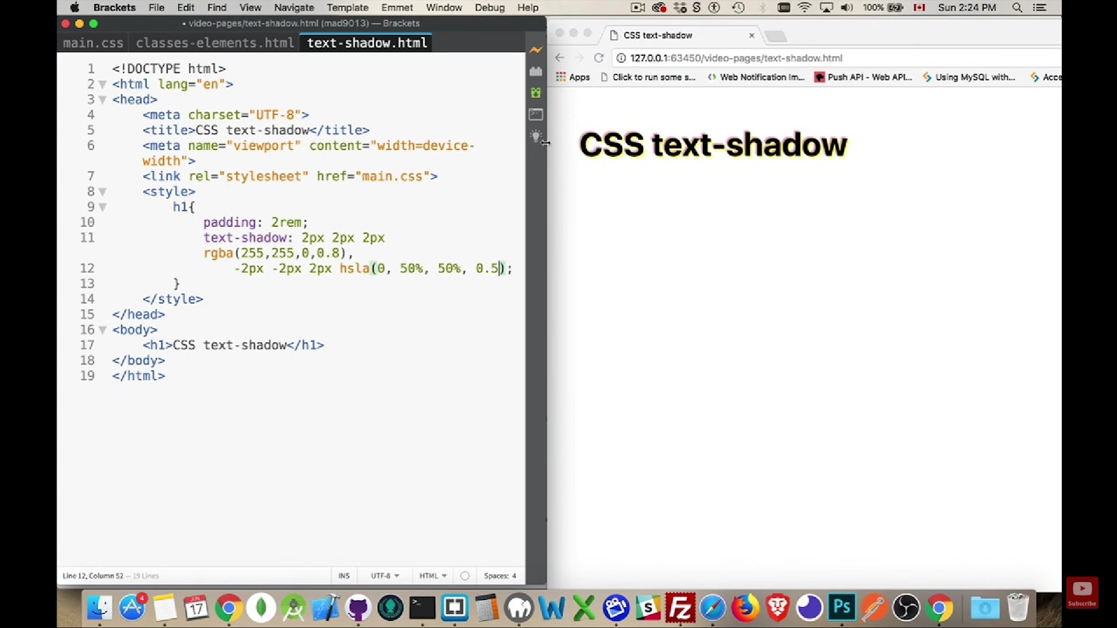
Importantly, the text-shadow property is not limited to a single shadow application. Multiple shadows can be applied by separating each set of values with a comma, each creating a different shadow effect. Using more than one text shadow can lead to visually striking designs. Here’s a quick example:
text-shadow: 1px 1px 2px black, 0 0 1em blue, 0 0 0.2em blue;
In this example, the text has three shadows: a black shadow that’s offset slightly to the right and down, and two blue shadows that create a glow effect around the text.
Another trick of the text-shadow property trade is the use of HSLa and RGBa color values. RGBa stands for Red Green Blue Alpha, and HSLa stands for Hue Saturation Lightness Alpha. The ‘Alpha’ in both refers to the level of transparency and allows you to adjust how your text shadows appear. Transparent text shadows can create a more subtle, layered effect. Let’s see how a transparent shadow looks in action:
text-shadow: 0px 2px 2px rgba(255, 255,255, 0.4);
In this case, this shadow applied isn’t fully opaque but has a transparency level of 40%. This allows the background to slightly show through the shadow, creating a softer, more sophisticated effect.
In conclusion, learning the ins and outs of the text-shadow property is an essential strategy in web design. It allows for a whole new realm of creative possibilities, opening the gateway to more dynamic and interactive website designs. So, ready your development tools and start creating stunning text effects that can significantly enhance user engagement.
A Closer Look at the Text-Shadow Property Values in CSS
Behind each shadow effect created by the CSS text-shadow property, lie specific values determining its final appearance. Gaining a deeper understanding of how these values operate is the key to creating more vibrant and engaging website designs.
Offset-x and Offset-y
These two values are fundamental for positioning your text shadow. They represent the horizontal (x-axis) and vertical (y-axis) distances of the shadow from the text.
The offset-x value works as follows:
- Positive values place the shadow to the right of the text;
- Negative values position the shadow to the left;
- A value of 0 aligns the shadow horizontally with the text, making it appear directly behind or underneath.
The offset-y value functions similarly:
- Positive values place the shadow below the text;
- Negative values position the shadow above;
- A value of 0 aligns the shadow vertically with the text, creating a backdrop effect.
Color
Color is an optional value for the text-shadow property, but it significantly impacts the final design. If no color is specified, the shadow will adapt the color set by the user agent (typically the browser).
The color value can be placed either before or after the offset values. It supports different formats, such as named colors (e.g., “red”), hexadecimal color codes (e.g., “#FF0000”), RGB (e.g., “rgb(255,0,0)”), RGBA (e.g., “rgba(255,0,0,0.5)”), HSL (e.g., “hsl(0,100%,50%)”), or HSLA (e.g., “hsla(0,100%,50%,0.5)”), offering unlimited color possibilities.
Blur Radius
The blur radius denotes the extent to which the color around the shadow’s edge is diffused. The default value is 0, meaning no blur. As the value increases, the shadow becomes larger and more blurred, giving a softer, more diffuse glow around the text.
In all, tweaking these values allows you to experiment with depth, diffusion, direction, and color of shadows, contributing to a richer, more dynamic web design. Be sure to test various combinations, and remember, subtler text shadows often yield the most professional results.
Unraveling Browser Compatibility with CSS Text-Shadow
In the realm of web development, understanding browser support for different CSS properties plays a crucial role in delivering a seamless user experience. Luckily, the text-shadow property enjoys extensive support across virtually all major browsers, uncapping the potential for creating dynamic and engaging text effects on web pages.
Broad Spectrum Support
The text-shadow property is now widely recognized and doesn’t require browser prefixes. Internet Explorer 10 and subsequent versions are fully compatible with this property. In addition, Firefox, Chrome, Safari, and several other browsers also support text-shadow.
However, it’s worth noting that Safari 5.1 has a unique requirement. In this version, it’s compulsory to define a color for the shadow, unlike other browsers where it’s optional. Therefore, developers working with this version need to include a color in the text-shadow property to ensure correct functioning.
Considerations for Opera Mini
Opera Mini, though supportive of the text-shadow property, ignores the blur-radius value. As a result, shadows created in Opera Mini will always appear hard-edged and pronounced since the blur effect will not be visible.
In essence, understanding these slight nuances and variations can help developers optimize their designs and ensure an identical visual experience across all browsers. Continuous evolution in web standards means browser compatibility can change, so it’s wise for developers to stay updated on these shifts. Various online resources, such as Can I Use, can provide real-time updates on feature support across different browsers.
Conclusion
In conclusion, within the intricate realm of web design, the meticulous attention to detail, from the selection of fonts to the precise positioning of elements, underscores the significance of every pixel. CSS, notably text-shadow, emerges as a potent ally, enabling designers to infuse their creations with captivating aesthetics and seamless functionality. By mastering text-shadow, designers unlock a realm of creative possibilities, from enhancing readability to adding visual depth, ultimately crafting immersive and engaging user experiences. Armed with the knowledge and skills garnered from this comprehensive guide, both seasoned developers and aspiring novices are poised to harness the full potential of text-shadow in CSS, propelling their web design endeavors to new heights of excellence.