Among these elements, button styling stands out as a fundamental aspect that can greatly impact how users interact with a website. From basic CSS buttons to advanced techniques, the design choices made in button styling can elevate the overall aesthetics and functionality of a website’s interface.
In this comprehensive guide, we delve into the world of CSS button styling, exploring a myriad of techniques and styles to empower web designers in crafting captivating and user-friendly interfaces. From understanding the basics of CSS button creation to implementing advanced animations and effects, this article serves as a roadmap for designers looking to elevate their button styling game. Let’s embark on a journey to discover ten must-try CSS button styles that will revolutionize website design and captivate users from the moment they land on a page.
Customizing Button Shapes
In the dynamic landscape of web design, buttons serve as essential elements that not only guide user interactions but also contribute significantly to the visual aesthetics of a website. While traditional rectangular buttons are ubiquitous, web designers are increasingly exploring creative avenues to customize button shapes, adding a distinctive flair to their designs.
- Rounded Corners: One of the simplest yet effective ways to customize button shapes is by incorporating rounded corners. By adjusting the border-radius property in CSS, designers can seamlessly transform standard rectangular buttons into sleek, rounded-edge variants. This subtle modification not only softens the overall look of the button but also adds a touch of elegance to the design. Experimenting with different border-radius values allows designers to achieve varying levels of curvature, enabling them to tailor the button’s appearance to suit the overall design aesthetic;
- Circular Buttons:For designers seeking to infuse a sense of whimsy and playfulness into their designs, circular buttons offer an enticing option. Creating circular buttons involves setting the border-radius property to 50%, effectively transforming square or rectangular buttons into perfectly rounded shapes. This approach lends a modern and eye-catching element to the design, making the buttons stand out while maintaining a harmonious visual balance. Circular buttons are particularly well-suited for applications and websites that prioritize a clean and minimalist design aesthetic;
- Polygonal Shapes: Beyond the confines of traditional geometric shapes, designers can explore polygonal button designs to inject a sense of dynamism and creativity into their interfaces. By leveraging CSS techniques such as pseudo-elements and clip-path, designers can craft buttons with intricate polygonal outlines, ranging from simple triangles to complex multi-sided shapes. This level of customization allows designers to align button shapes with specific design motifs or thematic elements, resulting in visually engaging and memorable user experiences;
- Custom SVG Shapes: For unparalleled flexibility and creativity in button shape customization, designers can turn to custom SVG (Scalable Vector Graphics) shapes. By designing unique graphics using vector graphics editors such as Adobe Illustrator or Inkscape, designers can imbue buttons with virtually any shape imaginable. These custom SVG shapes can then be seamlessly integrated into button designs using CSS, offering endless possibilities for creative expression. Whether incorporating brand logos, intricate illustrations, or stylized icons, custom SVG shapes enable designers to craft buttons that resonate with the unique identity and aesthetic of the website or application.
In the realm of web design, customizing button shapes presents a compelling opportunity for designers to elevate the visual appeal and user experience of their interfaces. Whether opting for subtle rounded corners, playful circular buttons, geometrically intriguing polygons, or bespoke SVG shapes, the possibilities for customization are boundless. By embracing innovative approaches to button shape design, designers can create interfaces that captivate users, foster intuitive interactions, and leave a lasting impression. As the digital landscape continues to evolve, the art of button shape customization remains a potent tool for shaping the future of web design.
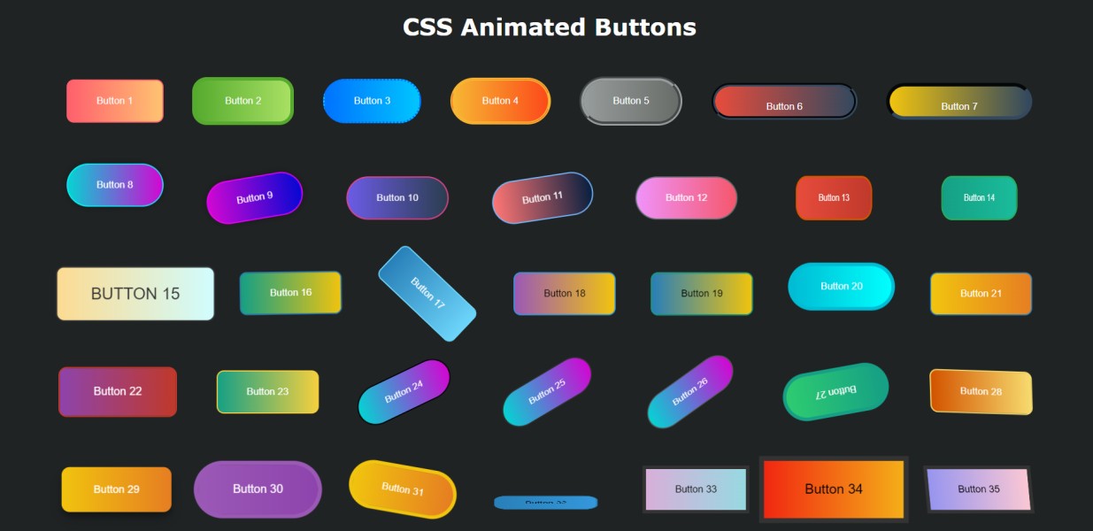
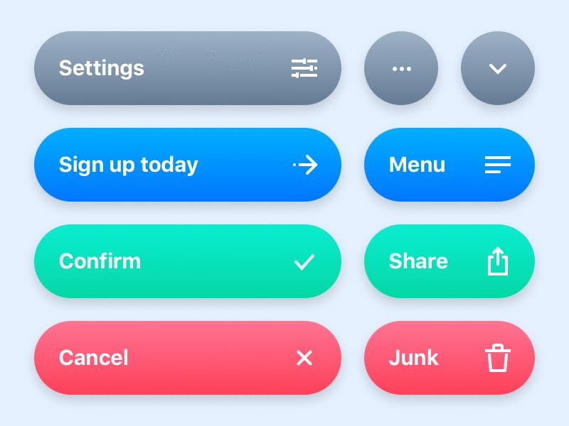
Button CSS examples
Buttons are the gatekeepers to interaction on any website, offering users a means to navigate, submit forms, or trigger actions. However, their design isn’t merely functional—it’s an opportunity for creativity and brand expression. Below, explore diverse CSS examples that breathe life into buttons, transforming them from mere elements into captivating focal points of your website design.
Rounded Corners
Crafting buttons with rounded corners is a straightforward process with CSS. The border-radius property enables defining the radius of a button’s corners, offering flexibility in achieving desired roundness levels. Experimentation with various values yields diverse visual effects.
Circular Buttons
Transforming square buttons into perfect circles involves leveraging the border-radius property. By setting the border-radius value to 50%, square buttons seamlessly transition into circular shapes, adding a touch of elegance to your design.
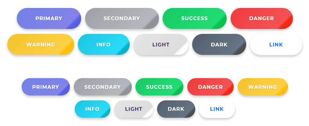
Explore limitless customization possibilities through Purecode.ai’s marketplace, featuring thousands of CSS components. Discover buttons, tables, grids, and more to elevate your website’s visual appeal.
Adding Hover Effects
Hover effects amplify button interactivity, providing users with visual feedback upon interaction. Simple color changes and transition effects are among the numerous hover effects to enhance user engagement.
Simple Color Change
Implementing a color change effect upon button hover is achieved effortlessly using the :hover pseudo-class in CSS. By altering background colors upon cursor positioning, users receive clear visual cues during interaction.
Transition Effects
Enhancing hover effects with transitions adds sophistication to button designs. The transition property, coupled with the :hover selector, facilitates smooth transitions between button states, elevating user experience with subtle visual enhancements.
Refer to in-depth tutorials for comprehensive insights into integrating hover effects seamlessly.
Implementing Button Animations
Button animations inject dynamism into user interactions, emphasizing key elements and providing feedback. Explore bounce effects and loading spinners to elevate button aesthetics and functionality.
Bounce Effect
Crafting lively bounce effects involves CSS animations and keyframes. By defining animation parameters like duration, timing function, and iteration count, buttons exude vitality, capturing user attention effectively.
Loading Spinner
Utilizing CSS animations, loading spinners signify ongoing processes, enhancing user experience during content loading. These dynamic animations offer visual feedback, indicating website responsiveness and engagement.
Icon Buttons
.Icon buttons serve as intuitive visual cues, guiding users through your website’s functionalities with ease. Leveraging CSS, you can craft icon buttons that not only captivate attention but also enhance user interaction. Below are CSS examples illustrating different approaches to crafting stunning icon buttons:
1. Simple Icon Button with Hover Effect:
css
.icon-button { background-color: transparent; color: #3498db; border: none; padding: 10px; cursor: pointer; transition: color 0.3s ease; } .icon-button:hover { color: #2980b9; }2. Circular Icon Button with Background Color:
css
.circular-icon-button { background-color: #3498db; color: #fff; border: none; padding: 10px; border-radius: 50%; cursor: pointer; transition: transform 0.3s ease; } .circular-icon-button:hover { transform: scale(1.1); }3. Floating Icon Button with Shadow Effect:
css
.floating-icon-button { background-color: #fff; color: #3498db; border: 2px solid #3498db; padding: 10px; border-radius: 50%; cursor: pointer; box-shadow: 0 4px 6px rgba(0, 0, 0, 0.1); transition: transform 0.3s ease, box-shadow 0.3s ease; } .floating-icon-button:hover { transform: translateY(-3px); box-shadow: 0 6px 8px rgba(0, 0, 0, 0.2); }4. Icon Button with Background Overlay:
css
.overlay-icon-button { background-image: linear-gradient(to bottom, rgba(52, 152, 219, 0.8), rgba(52, 152, 219, 0.8)), url('icon.png'); background-size: cover; color: #fff; border: none; padding: 10px; border-radius: 50%; cursor: pointer; transition: transform 0.3s ease; } .overlay-icon-button:hover { transform: scale(1.1); }5. Icon Button with Border and Glow Effect:
css
.glow-icon-button { background-color: transparent; color: #3498db; border: 2px solid transparent; padding: 10px; border-radius: 50%; cursor: pointer; transition: border-color 0.3s ease, box-shadow 0.3s ease; } .glow-icon-button:hover { border-color: #3498db; box-shadow: 0 0 10px rgba(52, 152, 219, 0.5); }These CSS examples demonstrate how icon buttons can be styled to complement your website’s design language while providing an engaging user experience. Experiment with these techniques, customize them to fit your brand aesthetics, and watch as your icon buttons become powerful navigational aids and visual highlights on your website.
Font Awesome Icons
Leverage Font Awesome’s extensive icon library to enrich button designs. By incorporating icons into buttons and customizing their appearance, websites attain enhanced visual communication and aesthetic appeal.
Custom SVG Icons
Crafting bespoke SVG icons enables unique button designs tailored to specific brand aesthetics. Utilize vector graphics editors to design icons, seamlessly integrating them into buttons for a personalized touch.
Responsive Button Designs
Ensuring button responsiveness across diverse devices and screen sizes is paramount. Employ flexible sizing techniques and media queries to maintain visual consistency and functionality across platforms.
Flexible Sizing
Buttons with flexible sizing adapt to available space using percentage-based widths and strategic padding application. Utilizing CSS classes for different button sizes ensures scalability and consistent design across varying contexts.
Media Queries
Media queries enable conditional styling based on screen size and device type, ensuring optimal button presentation across diverse environments. Responsive designs guarantee seamless user experiences across devices and resolutions.
Accessible Buttons
Ensuring accessibility in web design is paramount to creating an inclusive online environment for all users. When it comes to buttons, implementing accessibility features is essential to guarantee easy interaction for individuals with disabilities. Here’s how you can create accessible buttons using CSS:
1. Semantic HTML:
Start with semantic HTML elements like <button> or <a> to ensure proper button functionality and accessibility.
2. Keyboard Focus Styles:
Provide clear visual indication of keyboard focus by adding styles to the :focus pseudo-class. This helps users navigate through buttons using keyboard-only interactions.
css
.button:focus { outline: 2px solid #3498db; /* Add additional focus styles as needed */ }3. High Contrast and Large Click Areas:
Ensure buttons have high contrast between text and background colors for improved readability. Additionally, allocate sufficient padding to create large clickable areas, aiding users with motor impairments.
css
.button { padding: 12px 24px; background-color: #3498db; color: #fff; }4. Descriptive Labels:
Utilize descriptive text or ARIA attributes (aria-label or aria-labelledby) to provide context for buttons, especially for icon-only buttons.
html
<button aria-label="Search"> <i class="fas fa-search"></i> </button>5. Focus Indicator Customization:
Customize focus indicators to match your design aesthetic while ensuring sufficient contrast and visibility.
css
.button:focus { box-shadow: 0 0 0 3px rgba(52, 152, 219, 0.5); }6. Screen Reader Accessibility:
Test button functionality with screen readers to ensure proper announcements and navigation cues are provided.
7. Use of ARIA Roles:
Implement ARIA roles like role=”button” for non-button elements styled as buttons to maintain accessibility semantics.
html
<div role="button" tabindex="0"> Click me </div>By adhering to these principles and incorporating accessible design practices into your CSS button styles, you can create a more inclusive and user-friendly web experience for all individuals, regardless of their abilities or assistive technologies. Remember, accessibility is not only a legal requirement but also a moral imperative, promoting equal access and usability for everyone.
Conclusions
The journey through CSS button styling has illuminated the vast array of possibilities available to web designers seeking to enhance their website’s visual appeal and user experience. From mastering the fundamentals of button creation to exploring advanced techniques such as 3D buttons and glassmorphism, this guide has provided valuable insights and practical tips for designers at every level.
By incorporating these techniques into their design repertoire, web designers can create interfaces that not only look visually stunning but also provide seamless and engaging user interactions. Whether it’s through simple hover effects or complex animations, the power of CSS button styling lies in its ability to captivate and delight users, making their browsing experience more enjoyable and memorable.