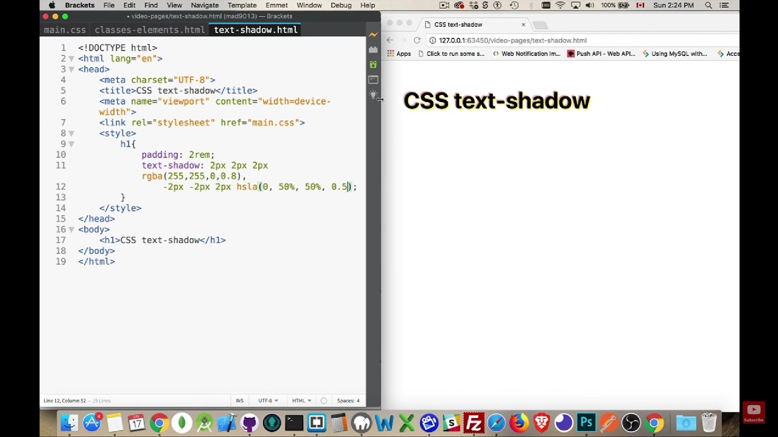
In the ever-evolving realm of front-end development and design, a profound understanding of CSS units is paramount. Em and rem emerge as dynamic tools, providing developers with the flexibility and scalability required for specifying lengths and sizes. This exploration delves into the nuanced distinctions between em and rem units, offering practical insights into their diverse applications.
Decoding Rem in CSS
Rem, short for root em, functions as a unit tied to the font-size of the root element, typically set at 16px in browsers. This unit champions proportional sizing and spacing, ensuring consistency across documents.
By establishing the foundational font-size, developers can employ rem units for lengths that seamlessly adapt, fostering uniformity in design.
```css

html { font-size: 16px; }

p { margin: 1rem; }

```
In this context, the paragraph’s margin aligns with the root element’s font-size, maintaining a proportional 16px margin.
Navigating Em in CSS
In contrast, em units are relative to the font-size of the parent element. This dynamic unit proves invaluable for maintaining consistent padding and spacing in responsive designs. The use of em units ensures that elements adapt proportionally to alterations in display sizes, cultivating flexibility in layouts.
Example of em units in CSS:
```css

p { font-size: 16px; margin: 1em; }

```
Here, the paragraph’s margin dynamically aligns with the font-size of its parent element, showcasing adaptability.
Distinguishing Rem and Em Units
The core disparity lies in their relative reference points. Rem units anchor to the root element’s font-size, while em units scale based on the font-size of the element they embellish. Consequently, tweaking the parent element’s font-size impacts em units but leaves rem units steadfast.
Example illustrating the difference:
```css

:root { font-size: 18px; }

.card { font-size: 1rem; padding: 2em; margin: 2em; }

.card-large { font-size: 1.25rem; }

.card-small { font-size: 0.875rem; }

```
Both units are scalable, yet rem ensures steadfast consistency, whereas em thrives in nuanced proportional adjustments.
Choosing Between Em and Rem
Beyond the traditional pros and cons, understanding the nuanced benefits of em and rem can significantly enhance your web development practices. While rem units excel in maintaining document-wide consistency, scalability, and simplicity, em units offer a distinctive advantage in cases demanding proportional sizing and spacing tied to the parent element’s font-size. However, caution is warranted with em due to its compounding effects in complex nested structures.
Explore more in this video
Enhancing Designs with Em and Rem
In the contemporary web development landscape, responsive typography has become synonymous with effective design. Em and rem units play a crucial role in achieving this, with rem units providing a consistent baseline for font size adaptation across diverse screen dimensions.
Simultaneously, em units allow for nuanced adjustments, empowering designers to fine-tune typography within specific components. This symbiotic relationship ensures that text remains not only legible but also aesthetically pleasing, catering to the diverse preferences of modern users.
Em and Rem in Mobile-First Development
The mobile-first approach, emphasizing design for smaller screens before scaling up, aligns seamlessly with the capabilities of em and rem units. Rem, as the root em unit, lays the foundation for mobile-friendly layouts.
Em units, scaling relative to parent elements, empower developers to create components that gracefully adapt to the constraints of mobile devices. This adaptability is crucial for delivering a consistent and enjoyable user experience across the spectrum of devices, from smartphones to large desktop screens.
Accessibility: A Consideration with Em and Rem
In an era where accessibility takes center stage, em and rem units significantly contribute to creating inclusive web experiences. Rem units, with their document-wide consistency, aid in establishing interfaces that cater to users with diverse needs.
Em units, offering proportional adjustments, ensure that content remains accessible and readable, even when users zoom in or adjust their display settings. Thoughtful incorporation of these units contributes to a more inclusive digital environment.
Conclusion
As stalwarts in the CSS toolkit, em and rem units continue to shape the future of web development. Their versatility in accommodating responsive design trends, mobile-first strategies, and accessibility considerations makes them indispensable for crafting web experiences that transcend device boundaries and user preferences.
Developers armed with a nuanced understanding of em and rem units are well-equipped to navigate challenges and possibilities, ensuring the creation of websites that are both visually appealing and functionally adept.


